






ThirdWay Capital
An identity for an investor in Africa’s growth-ready businesses, serious enough for investors and bold enough for founders.
- Client
- ThirdWay Capital (TWC)
- Sector
- Venture investment
- Year
- 2022
- What we did
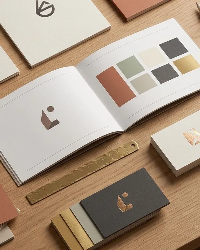
- Research, art direction, logo, colour and type, patterns, stationery, campaign visuals, landing page, style guide
Capital for the businesses shaping Africa
ThirdWay Capital is a venture holding company that invests in growth-ready small and medium enterprises shaping the African story, and measures its returns in two ways: financial and societal.
It backs founders who have proven they can grow a business, with experienced, boots-on-the-ground intelligence, strategic capital and advisory support.
One brand, two very different audiences
Investing across the African continent is competitive and complex. To break into that market, TWC had to speak to two opposite audiences at once, investors and founders, with equal attention to seriousness and adventure.
Our task was a new look that expressed the brand’s DNA, won over both audiences and took them on a journey to understand what TWC stands for.
A third way, hidden in the arrow
We spent months working with the TWC team in Canada and Ghana, researching, exploring and tinkering until the art direction was clear.
The new logo is a bold, upward-moving arrow made of three strokes, with a second arrow hidden in the negative space. Together they carry the idea at the heart of the business: a third way to deploy capital, beyond venture capital and private equity on one side and non-profit community development on the other.
Cobalt, a flash of yellow and a pattern that points up
Deep cobalt and space-sea blues give the brand its seriousness; turquoise and an off-yellow bring the adventure. Givonic, a modern geometric typeface, keeps it clear and corporate, and the arrow repeats into a chevron pattern that always points forward.
Activating the power of African business
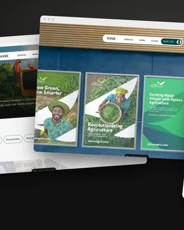
The identity came to life in a campaign about economic, social and environmental prosperity, campaign artwork placing the people TWC exists for inside the arrow, stationery, a landing page and a style guide.
Your brand next
Want a brand that tells its story this clearly?
Tell us what you’re building. We’ll show you how we’d bring it to life.