




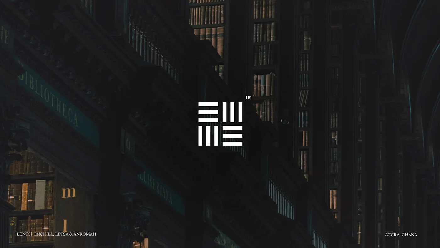
Bentsi-Enchill, Letsa & Ankomah
A refreshed identity for one of Ghana’s leading law firms: modern and approachable, without losing the weight of its legacy.
- Client
- Bentsi-Enchill, Letsa & Ankomah (BELA)
- Sector
- Legal
- Year
- 2024
- What we did
- Identity refresh, colour and type, brand patterns, stationery, publications, portraits, social and web, brand guide
Three decades of trusted counsel
Bentsi-Enchill, Letsa & Ankomah was founded in 1990 to give its clients excellent, market-leading legal services. Since then the firm has built its reputation on the most complex transactions and disputes, for foreign investors, local companies, statutory bodies and the government.
Modern, without losing the legacy
BELA wanted a visual identity in step with contemporary branding, one that would reinforce its commitment to excellence, client focus and innovation in Ghana’s legal sector, without compromising the standing it has earned.
The priorities were simplicity, accessibility and a refined look, carried across the logo, colours, typography, social media, marketing materials and a detailed brand guide.
Refine the mark, don’t replace it
The firm’s original logo was inspired by Nea Onnim, the Adinkra symbol of knowledge, lifelong learning and the continued quest for wisdom. Rather than a complete overhaul, we chose a nuanced redesign: the same symbol, made simpler, more accessible and more confident.
The result keeps its link to the original while giving the firm a stronger, more approachable presence: tradition, refreshed.
Marine, bistre and a pattern drawn from the mark
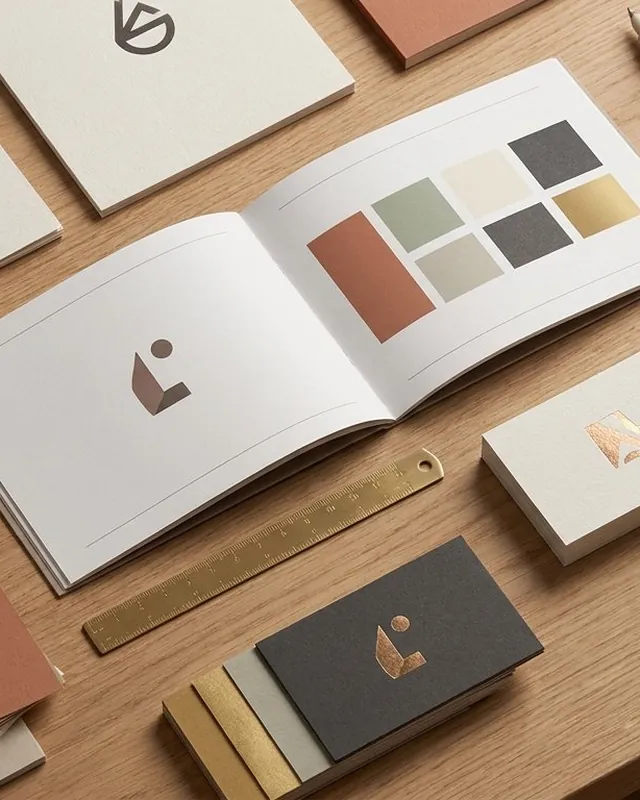
A deep marine blue leads the palette, supported by a warm bistre gold and quiet charcoals. Lora, a classic serif, carries the firm’s voice; Inter keeps everyday information clear. The lines of the mark repeat into a family of patterns that give every surface a quiet signature.
From letterhead to boardroom
The identity was rolled out across stationery, firm overviews and legal briefings, portraits of the partners, the website and social media, all held together by a detailed brand guide.
Your brand next
Want a brand that tells its story this clearly?
Tell us what you’re building. We’ll show you how we’d bring it to life.